
UX Redesign for a Global Mobility Platform
Designing and Validating a Unified Experience for Ordering Multiple Services
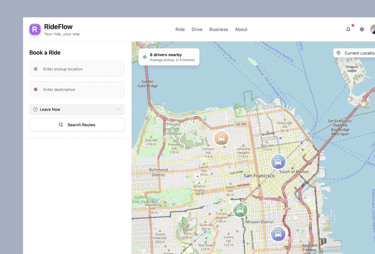
A global mobility platform wanted to make it easier for customers to access and order multiple services through a single digital experience.
The existing user experience had evolved around individual services. As the organization expanded its offerings, customers could potentially need more than one service, but navigating separate experiences for each service created unnecessary friction.
The goal was not to combine different services into a single order.
Instead, the organization wanted customers to be able to discover and initiate multiple distinct service orders from one unified interface, while allowing each service to retain its own workflow, requirements, and fulfillment process.
Stackular was responsible for the user experience strategy, UX design, interactive Figma prototypes, and direct usability testing with end customers.
Rather than moving immediately into software development, Stackular designed the new experience, created realistic interactive prototypes, tested those prototypes with actual customers, and refined the design based on observed user behavior.
The result was a customer-validated UX direction that gave the organization confidence in the new multi-service experience before investing in implementation.
The Challenge
Digital platforms often begin with a small number of services and relatively straightforward customer journeys.
As the platform expands, simply adding more services to the existing navigation can create a fragmented experience.
That was the challenge facing this organization.
Customers could potentially need several services from the same company, but the existing interaction model primarily treated each service as its own experience.
The organization wanted customers to be able to enter through a common interface and easily understand:
- which services were available
- what each service provided
- which services were appropriate for their needs
- how to begin a request
- which service requests they had already initiated
- how to begin another service request
- what information was required for each service
At the same time, the underlying services remained operationally distinct.
Each service could have its own:
- eligibility requirements
- information requirements
- workflows
- business rules
- fulfillment processes
- backend systems
The UX challenge was therefore to create one coherent customer experience without incorrectly forcing different services into one artificial transaction model.
One Interface, Multiple Independent Services
One of the most important design decisions was distinguishing between a unified experience and a combined order.
The redesigned interface gives customers a common place to discover and initiate multiple services.
However, each service remains its own transaction.
Conceptually, the experience is:
One interface initiates independent service requests
- Service A requestIndependent transaction
- Service B requestIndependent transaction
- Service C requestIndependent transaction
The services are not bundled into one combined order; their requirements, workflows, and fulfillment processes remain independent.
That distinction allowed the organization to simplify the customer experience without forcing operationally different services into the same backend process.
Stackular's Approach
Stackular approached the initiative as a product-design and user-experience problem rather than simply a visual redesign.
The team first focused on understanding the customer's goal:
A user should be able to access multiple services from one experience without having to understand how the company organizes those services internally.
That meant evaluating questions such as:
- How should customers discover available services?
- How should services be presented?
- How does a customer begin a second service after starting the first?
- How should the interface communicate that the requests are separate?
- What information can be reused across experiences?
- Where should service-specific information begin?
- How can customers understand where they are in each workflow?
- How should the experience grow as additional services are introduced?
These are structural product questions.
Solving them before development reduced the risk of building a polished interface around the wrong interaction model.
Designing Around Customer Intent
Enterprise systems are frequently structured around internal business boundaries.
Customers usually are not.
A company may have different:
- product teams
- fulfillment systems
- databases
- APIs
- business units
- operational processes
for different services.
The customer should not need to understand those boundaries merely to use the platform.
Stackular designed the experience around what the customer was trying to accomplish while allowing the individual service workflows underneath the experience to remain independent.
This is an important UX principle:
Unifying the customer experience does not require unifying every backend process.
Service Discovery
As organizations add services, discoverability becomes increasingly important.
Customers need to understand not only that a service exists but also whether it is relevant to what they are trying to accomplish.
The redesigned experience considered how services should be presented within a shared interface so customers could:
- identify available options
- understand differences between services
- select an appropriate service
- begin a request
- return to initiate additional services
This created a more scalable pattern than requiring customers to locate separate application entry points for every offering.
Keeping Individual Service Workflows Clear
A unified experience can create a new problem if users begin to believe several distinct requests have become a single transaction.
The design therefore needed to communicate the distinction between:
the overall customer experience
and
the individual service request
Each service could continue to have its own steps and requirements while still feeling like part of the same digital platform.
That balance was central to the redesign.
Reducing Repetitive Customer Effort
A multi-service experience also raises an important product-design question:
Which information belongs to the customer, and which information belongs to a particular service request?
Where appropriate, the UX could avoid making customers repeatedly navigate through the same orientation or account context simply because they were using another service.
At the same time, service-specific information remained associated with the appropriate individual request.
This distinction helps reduce unnecessary repetition without creating dependencies between transactions that should remain separate.
Interactive Prototyping with Figma
Stackular created interactive prototypes in Figma rather than moving directly from requirements into development.
The prototypes allowed customers and stakeholders to experience the proposed workflow in a realistic way.
Users could:
- navigate the interface
- select services
- begin requests
- move between experiences
- understand the relationship between services
- encounter realistic interaction patterns
That made it possible to evaluate the design before production software existed.
The prototype was therefore not simply a visual artifact.
It was a tool for answering important product questions.
Direct Testing with End Customers
Stackular conducted the usability testing directly with actual end customers.
This was particularly valuable because internal product teams already understood the company's service model.
Customers did not necessarily share that same mental model.
A workflow that feels obvious to the people who designed the underlying business processes may be confusing to someone encountering those services for the first time.
Stackular used customer testing to observe how users actually interacted with the proposed experience.
The testing focused on behaviors such as:
- whether customers understood the available services
- whether they knew how to initiate a service
- whether they understood that separate services created separate requests
- whether they could successfully initiate additional services
- where they hesitated
- which concepts required explanation
- whether navigation behaved as expected
Testing Behavior Rather Than Asking for Opinions
The goal of usability research was not simply to ask:
Do you like this design?
User preference can be useful, but task completion provides stronger evidence.
Stackular instead evaluated whether customers could successfully navigate realistic scenarios.
For example:
Find the service that meets this need.
Begin the request.
Now initiate an additional service.
Return to an existing request.
Observing how users perform those tasks reveals usability problems that may not appear during stakeholder reviews.
Iterative UX Design
Insights from testing were used to refine the prototypes.
The process followed a cycle of:
Design → Prototype → Test → Learn → Refine
This allowed Stackular to identify usability issues before they became engineering problems.
Navigation, terminology, information hierarchy, workflow structure, and service-selection patterns could all be changed quickly in Figma.
That is substantially less expensive than making the same changes after development has begun.
Stackular's Role
Stackular was responsible specifically for the UX and product-design portion of the initiative.
The engagement included:
- UX strategy
- workflow design
- interaction design
- information architecture
- Figma design
- interactive prototyping
- usability-test planning
- direct testing with end customers
- analysis of user behavior
- design iteration
Stackular was not responsible for production implementation of the redesigned experience.
Keeping that distinction clear is important.
The value of this engagement was determining and validating what should be built before the organization committed engineering resources to building it.
UX Validation as Delivery Risk Reduction
Software teams frequently begin implementation before major workflow assumptions have been tested.
That means product questions are discovered during engineering.
For example:
Users don't understand the distinction between these services.
Customers don't know how to start another request.
The navigation model doesn't make sense.
Customers think several requests have been combined into one order.
Discovering those issues after implementation can affect:
- frontend architecture
- API contracts
- data structures
- automated tests
- documentation
- development schedules
Discovering them in Figma primarily affects a design file.
UX validation is therefore not simply a design activity.
It is a form of software-delivery risk management.
Designing for Additional Services
The redesigned interaction model also needed to support future expansion.
A UX that works well for two services can become difficult to use if the organization eventually offers five, ten, or twenty.
Stackular therefore approached the experience as a reusable service-access model rather than designing only for the specific service combinations available at the time.
That required thinking about:
- scalable navigation
- service discovery
- consistent entry patterns
- service categorization
- request visibility
- reusable design components
This gave the organization a design foundation that could accommodate additional services more naturally over time.
UX Design as Product Architecture
This project demonstrates why UX design extends beyond screen appearance.
Decisions about how customers access multiple services affect the structure of the product itself.
For example:
Customer level
Who is the user and what context carries across the experience?
Platform level
How does the customer discover and navigate services?
Service level
What service is the customer requesting?
Request level
What information and workflow belong to that specific transaction?
Thinking through these concepts during UX design can expose important product and technical architecture questions before software development begins.
Key Design Decisions
Why One Interface Instead of Separate Portals?
Separate entry points may accurately reflect the company's internal systems, but they increase cognitive effort for customers.
A common experience makes it easier for customers to discover and access the company's broader set of services.
Why Keep the Orders Separate?
Different services can have different requirements and fulfillment processes.
Combining them artificially into a single order could create unnecessary dependencies and complicate downstream systems.
The better UX solution was to unify access and navigation while allowing the individual service transactions to remain independent.
Why Prototype Before Development?
The most important uncertainty was not technical feasibility.
It was whether customers would understand the new interaction model.
Interactive prototypes allowed Stackular to validate that model before substantial engineering investment.
Why Test with Real Customers?
Employees and product teams have institutional knowledge that customers do not.
Testing with actual end users reveals where the interface unintentionally assumes knowledge the customer may not have.
Why Did Stackular Perform the Testing?
Having the same UX team responsible for the design conduct the research created a tight feedback loop.
Design assumptions could be tested directly, observations could be translated into changes, and updated prototypes could be produced quickly.
Business and Product Results
Because Stackular's engagement ended at UX design and prototyping, this case study should not claim production conversion improvements or financial outcomes that were not measured.
The meaningful results occurred at the product-design and validation stage.
Customer-Validated UX Direction
The proposed multi-service experience was tested directly with actual customers rather than relying only on internal stakeholder assumptions.
Unified Multi-Service Experience
The redesign created a model for customers to access and initiate multiple services through a common interface while preserving separate service transactions.
Reduced Product Risk Before Development
The organization could identify and resolve usability problems before investing in production implementation.
Greater Stakeholder Alignment
Interactive Figma prototypes provided a concrete representation of the intended product experience for business, product, design, and engineering stakeholders.
Scalable Design Model
The interaction model created a foundation that could accommodate additional services without requiring the customer experience to fragment into separate portals.
Clearer Development Direction
Engineering teams could eventually work from a validated product experience rather than interpreting abstract requirements independently.
Technologies and Methods Used
Lessons for Organizations Designing Multi-Service Platforms
One Interface Does Not Mean One Transaction
A unified experience can sit above several independent business processes.
Trying to combine unrelated transactions simply to make the UI look unified can create unnecessary technical and operational complexity.
Design Around the Customer, Not the Organizational Chart
Customers do not care which internal team owns a particular service.
The digital experience should help them accomplish their objective while hiding organizational complexity where possible.
Validate the Mental Model
Before optimizing buttons and layouts, determine whether users understand the fundamental structure of the product.
If customers misunderstand the relationship between services and requests, polishing individual screens will not solve the core UX problem.
Prototype Structural Decisions First
Use prototypes to validate:
- navigation
- workflow
- service discovery
- information hierarchy
- transaction boundaries
These decisions have much greater downstream impact than visual styling.
Test with Actual Customers
Internal stakeholders are valuable participants, but they cannot replace end-user research.
People who already understand the system behave differently from customers encountering it without that background knowledge.
UX Research Can Prevent Engineering Rework
Finding a problem before implementation is usually much less expensive than discovering it after APIs, interfaces, tests, and integrations have been built.
Design for the Next Service, Not Just the Current Ones
Multi-service platforms should assume the service catalog will evolve.
A flexible interaction model reduces the likelihood that every new offering requires another UX redesign.
Frequently Asked Questions
What is a multi-service digital experience?
A multi-service digital experience gives customers access to several services through a common interface.
The underlying services do not necessarily need to share the same transaction, workflow, or backend system.
A well-designed experience can unify discovery and navigation while preserving the independence of individual services.
Does a unified customer experience require a single order?
No.
Several services can be presented through one interface while each continues to generate an independent request or order.
This is often preferable when services have different requirements, workflows, fulfillment processes, or backend systems.
Why use Figma prototypes before software development?
Interactive Figma prototypes allow teams to test workflows and product concepts before production software is built.
This makes fundamental changes much less expensive and allows customer feedback to influence the design while the product is still flexible.
Who should participate in usability testing?
Whenever possible, testing should include people who closely match the actual intended users.
Internal stakeholders can provide useful feedback, but they often possess knowledge about the product and business that customers do not.
What is task-based usability testing?
Task-based usability testing asks participants to accomplish realistic goals rather than simply comment on a design.
Researchers observe where users succeed, hesitate, become confused, or make unexpected decisions.
This provides evidence about how effectively the experience supports real behavior.
How does UX testing reduce software development risk?
UX testing identifies workflow, terminology, navigation, and information-architecture problems before they are implemented in production software.
Correcting those problems early can prevent rework across frontend code, APIs, data models, testing, and documentation.
Should UX design follow the backend architecture?
Not necessarily.
Backend systems should be structured around technical and operational requirements.
The user experience should primarily reflect how customers understand their goals and tasks.
Well-designed application and API layers can translate between those two models.
How do you design a platform for multiple independent services?
Important considerations include:
- common navigation
- service discovery
- clear transaction boundaries
- consistent interaction patterns
- account-level context
- service-specific workflows
- request visibility
- expansion to future services
The objective is consistency without forcing every service into an identical business process.
What is the difference between UX design and UI design?
UI design focuses primarily on the interface itself.
UX design addresses the broader experience, including:
- user goals
- workflows
- information architecture
- navigation
- terminology
- interactions
- usability
- customer research
Visual design is an important component of UX, but it is not the complete discipline.
When should an organization prototype instead of immediately developing?
Prototyping is particularly valuable when the organization is making significant decisions about:
- new workflows
- new products
- multi-step processes
- service consolidation
- navigation
- customer journeys
- unfamiliar interaction models
The greater the uncertainty around what should be built, the more valuable early prototyping becomes.
Related Services
Related Case Studies
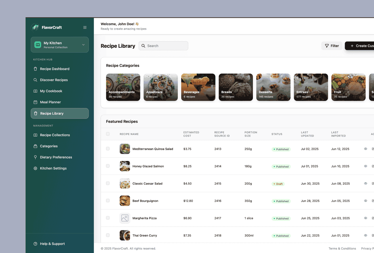
Extranet Modernization for a Global Hospitality Organization
A global hospitality organization relied on a long-running extranet to provide customers and business partners with access to operational content, training, supplier information, menus, recipes, alerts, and other digital services.

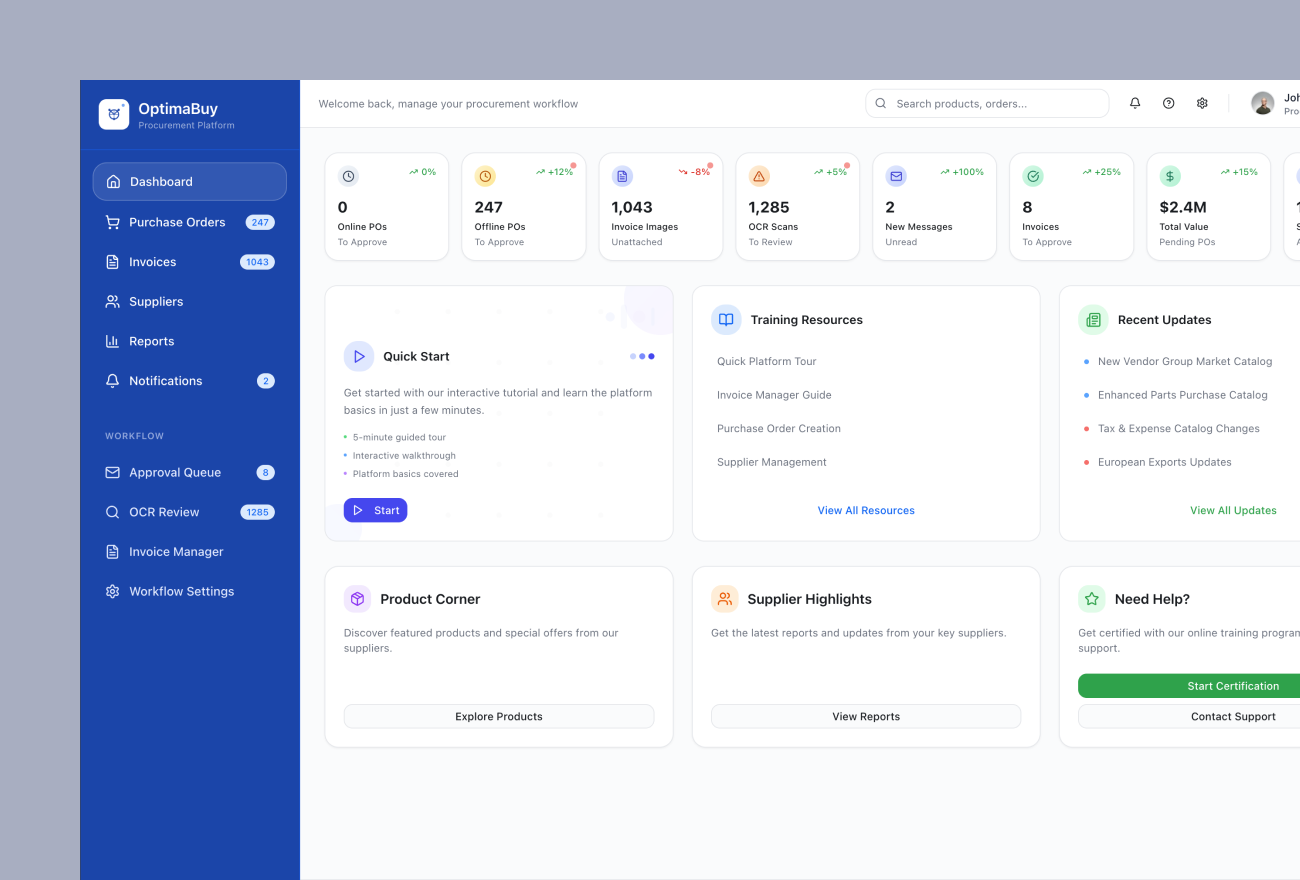
Procure-to-Pay Application Modernization for a Global Hospitality Organization
A global hospitality organization relied on a long-running procure-to-pay platform supporting purchasing, purchase orders, invoicing, receiving, financial workflows, supplier interactions, and customer-facing business processes.